Design Refresh
Disciplines:
Web Design, Social Media Graphics
Role:
Design, Art Direction
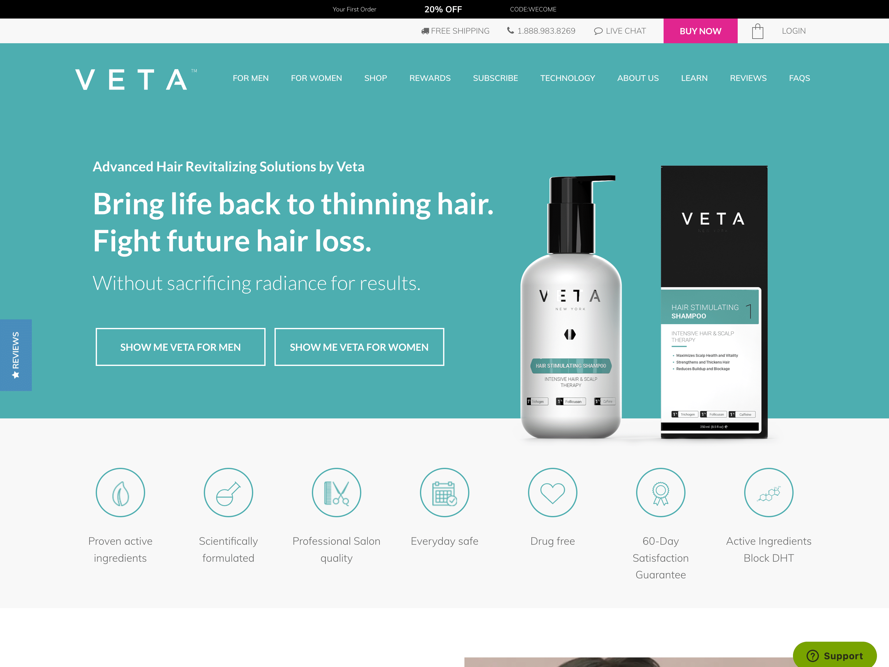
BYOMA is a skincare brand that offers a wide range of products meant to improve and better support the skin’s barrier.
I love the brand and the products, but when I visited the website, I noticed a disconnect between the brand, the products, the social media appearance, and the website itself.
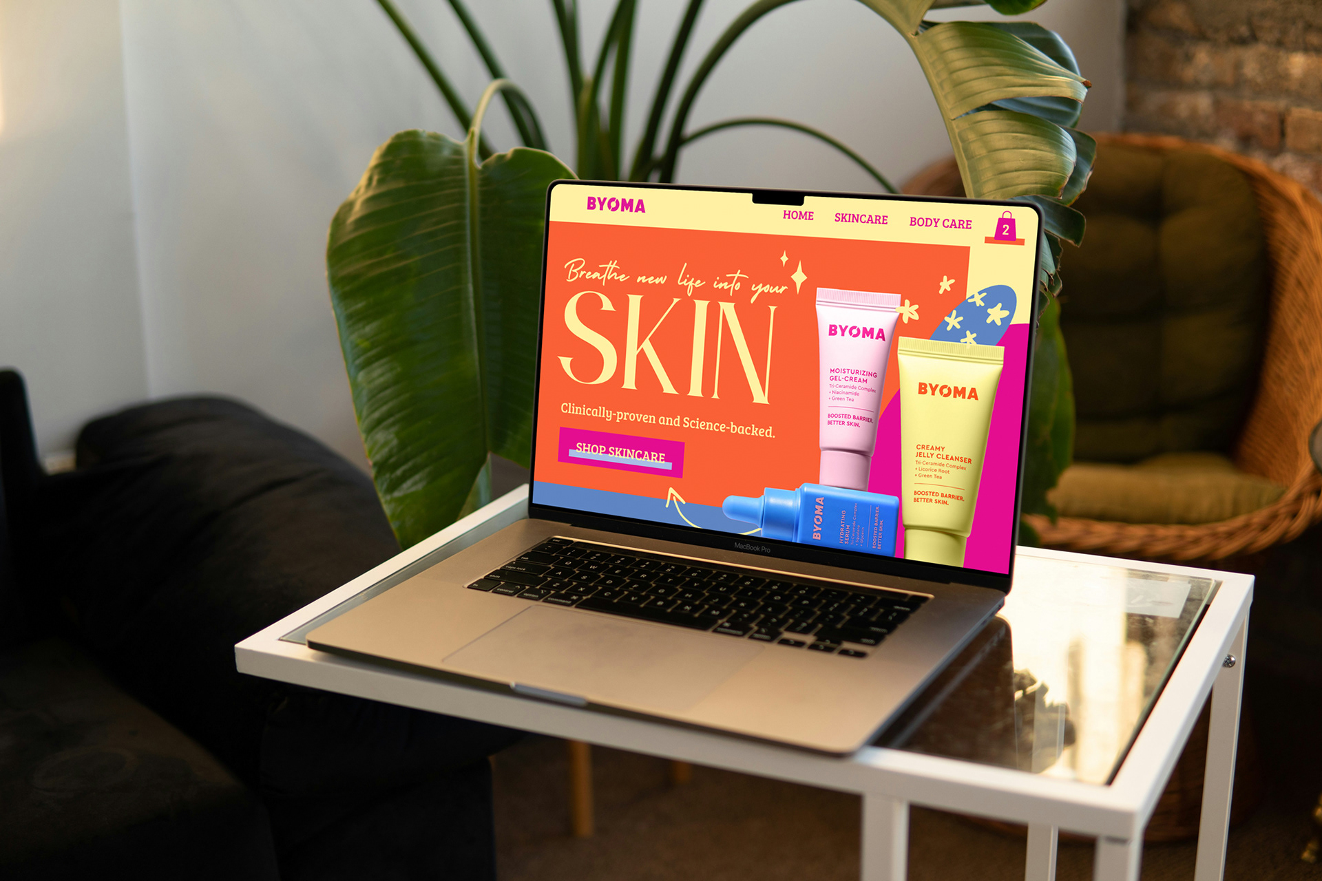
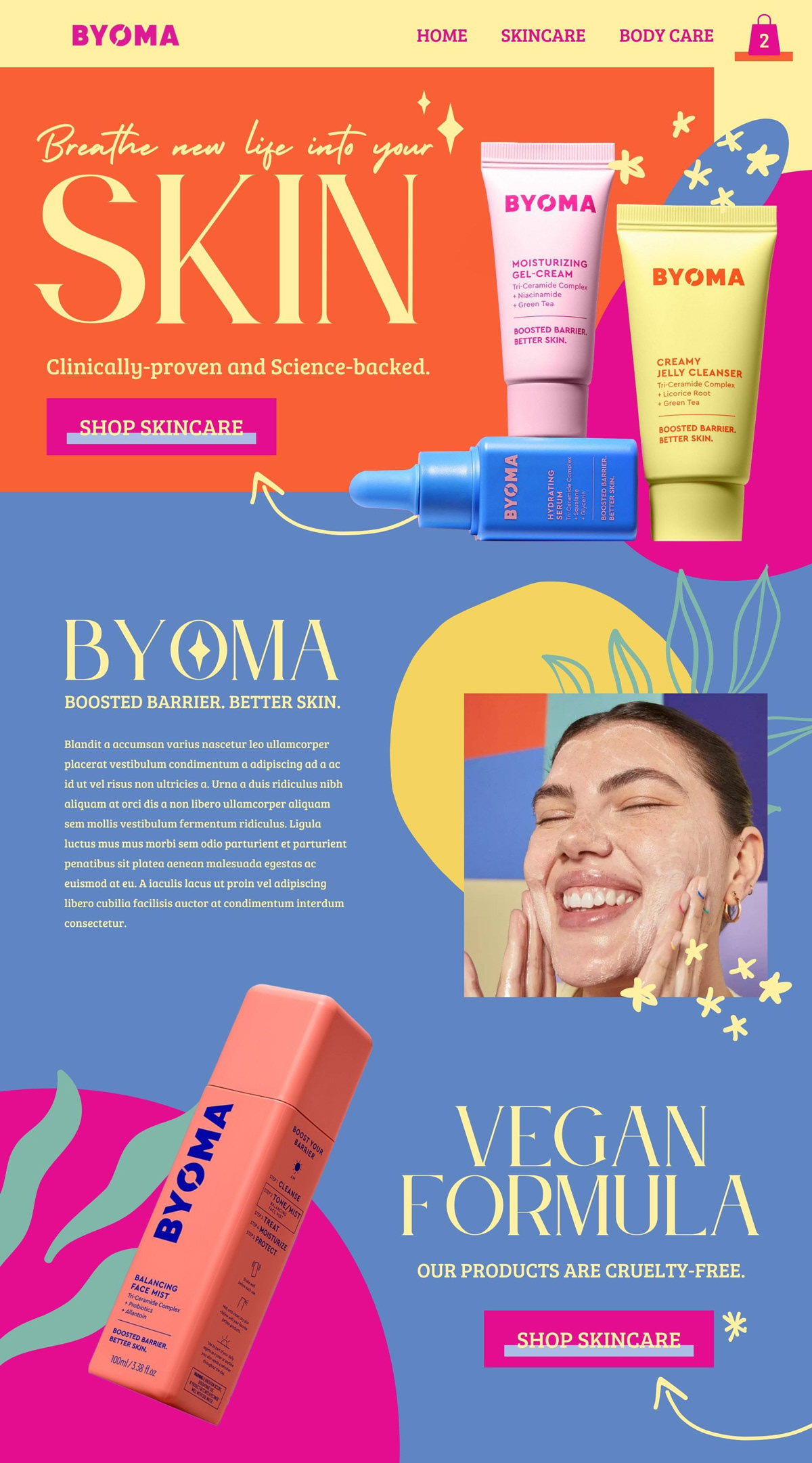
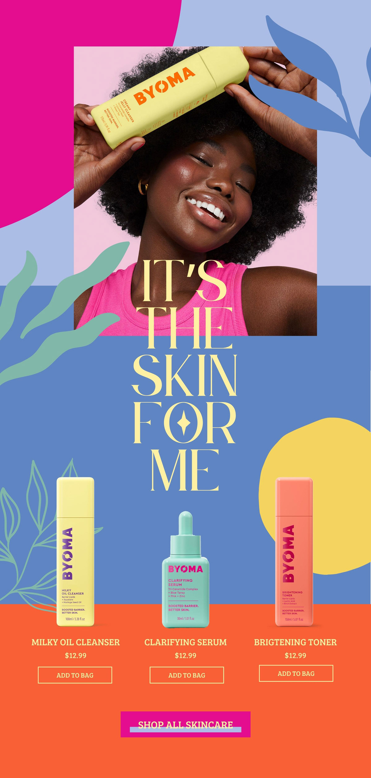
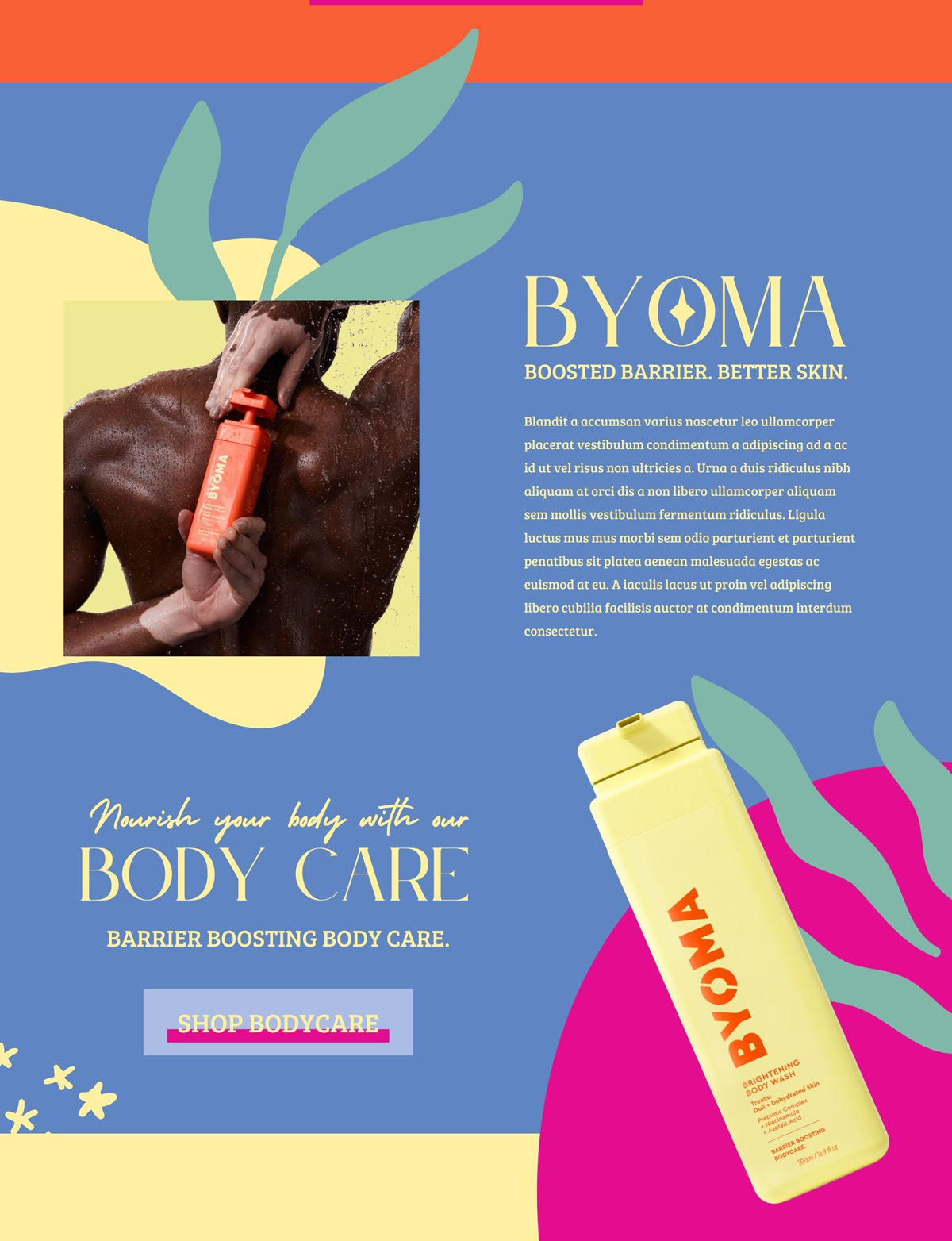
In this self-initiated “design refresh”, I designed a landing page and a collection of social media graphics to highlight the skincare and body care lines.
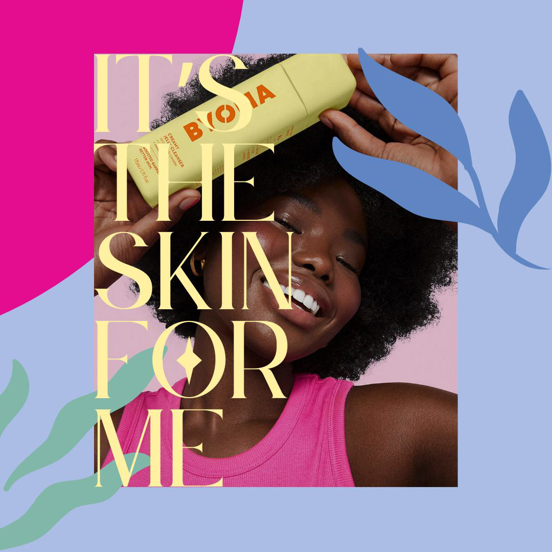
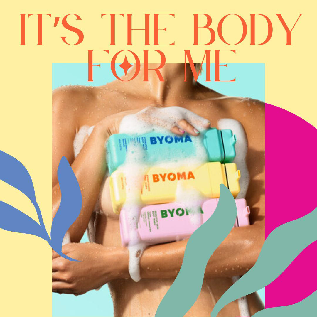
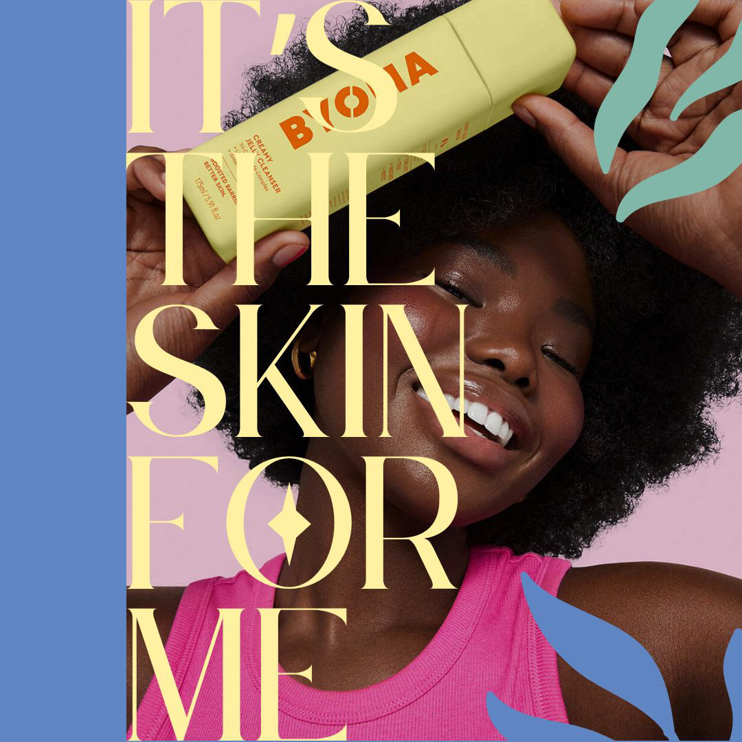
"It's the skin for me."
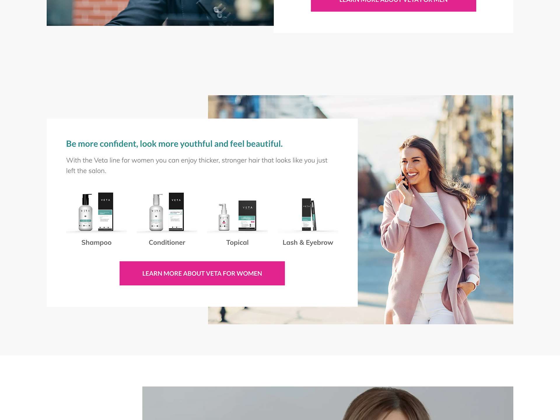
With the Audience in Mind
BYOMA’s target audience is Gen Z and millennials, but the website design seems to be geared toward a younger audience.
This design refresh aims to connect with and engage the Gen Z audience, who is deeply invested in social media, by using fun, colorful, and bright graphics.
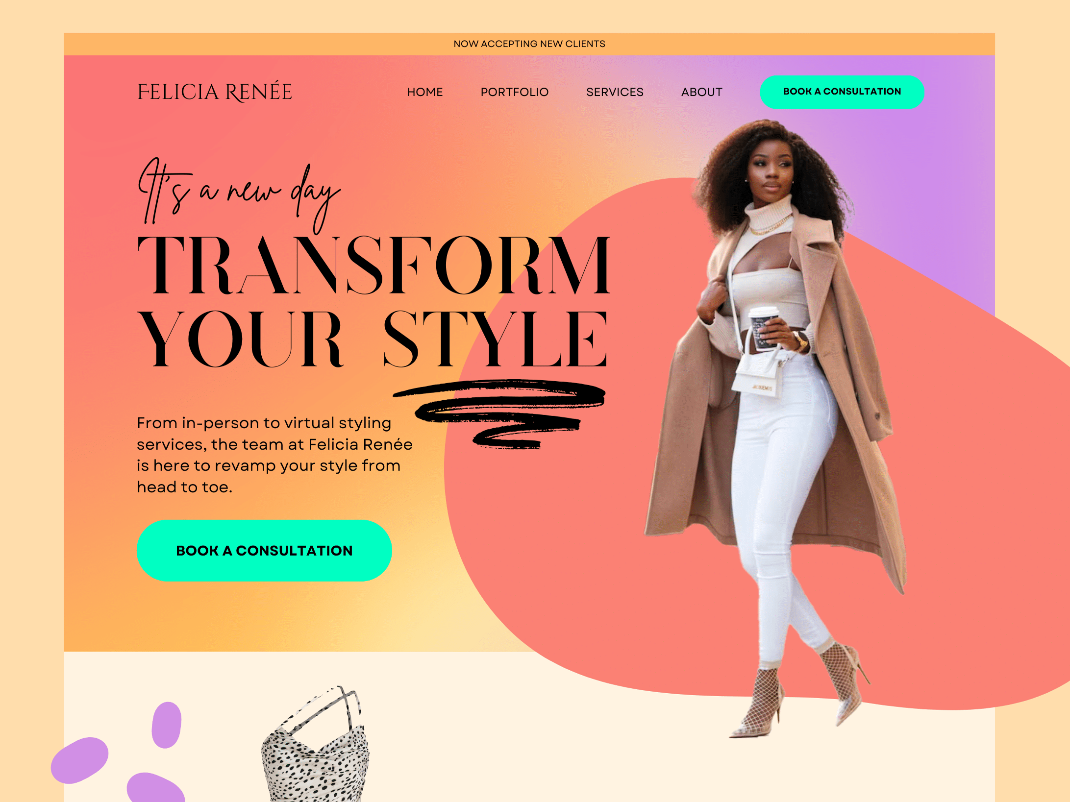
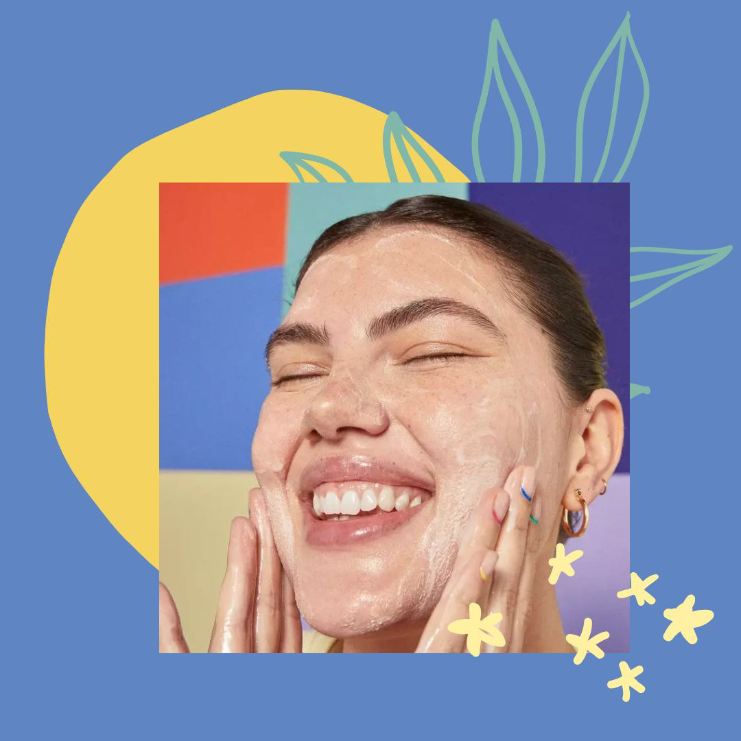
Using BYOMA's already amazing photography, I put together this landing page.
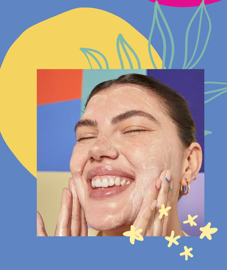
Natural and Playful
This landing page leans more into highlighting nature and plants to showcase the natural, vegan ingredients.
Yes, they’re natural, but they’re anything but boring and standard.
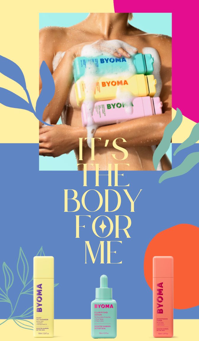
Fun and exciting colors are used to speak to their target audience— For the young and fun at heart who is mindful about what they use on their skin.
I also incorporated organic shapes and “hand-drawn” elements to bring in the personal touch.
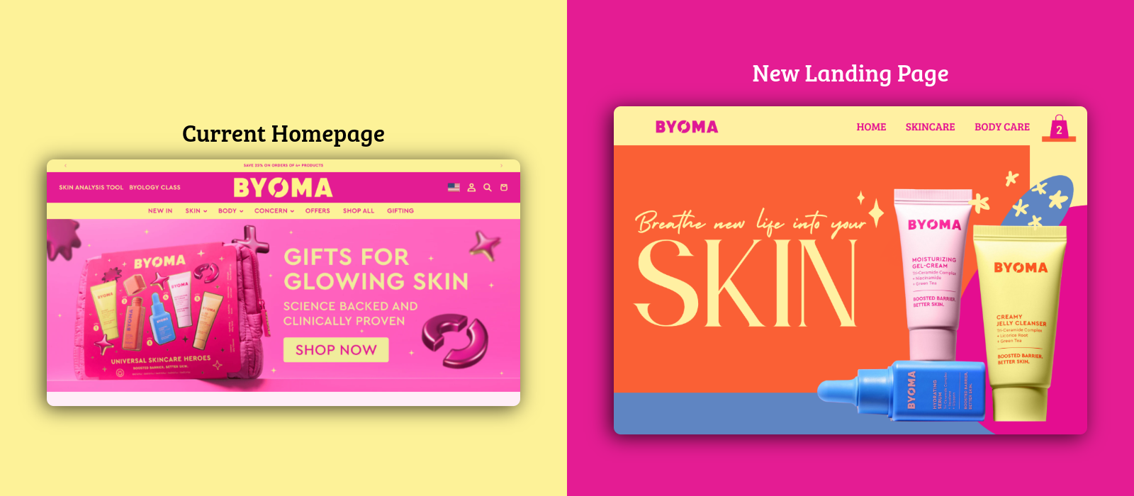
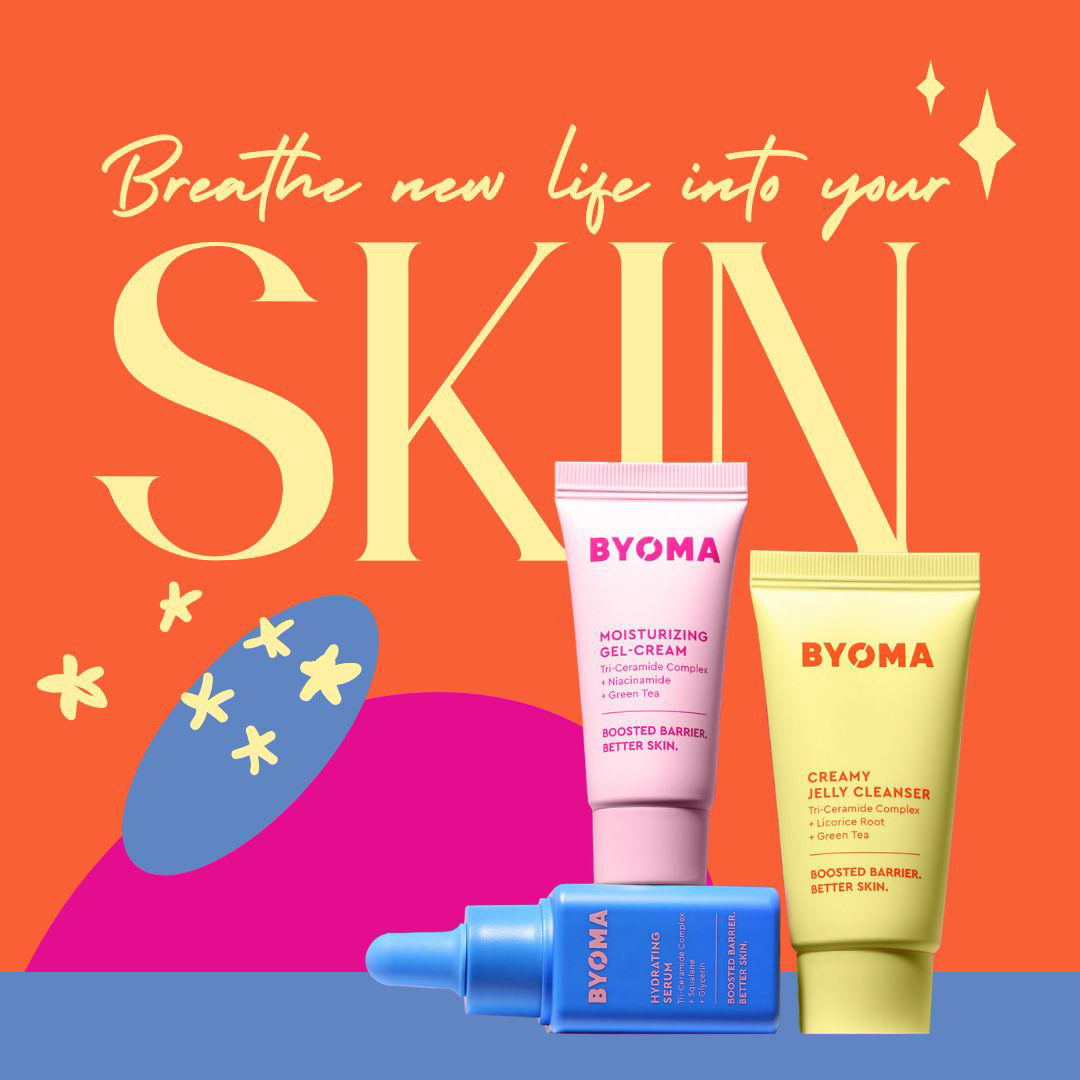
Color Refresh
On their website, they lean heavy into hot pink and yellow.
For this refresh’s color palette, I drew inspiration from the product line’s colorful bottles. They have a number of beautiful colors throughout their product line, so it’s important to continue that through to the marketing.
Full Landing Page Design
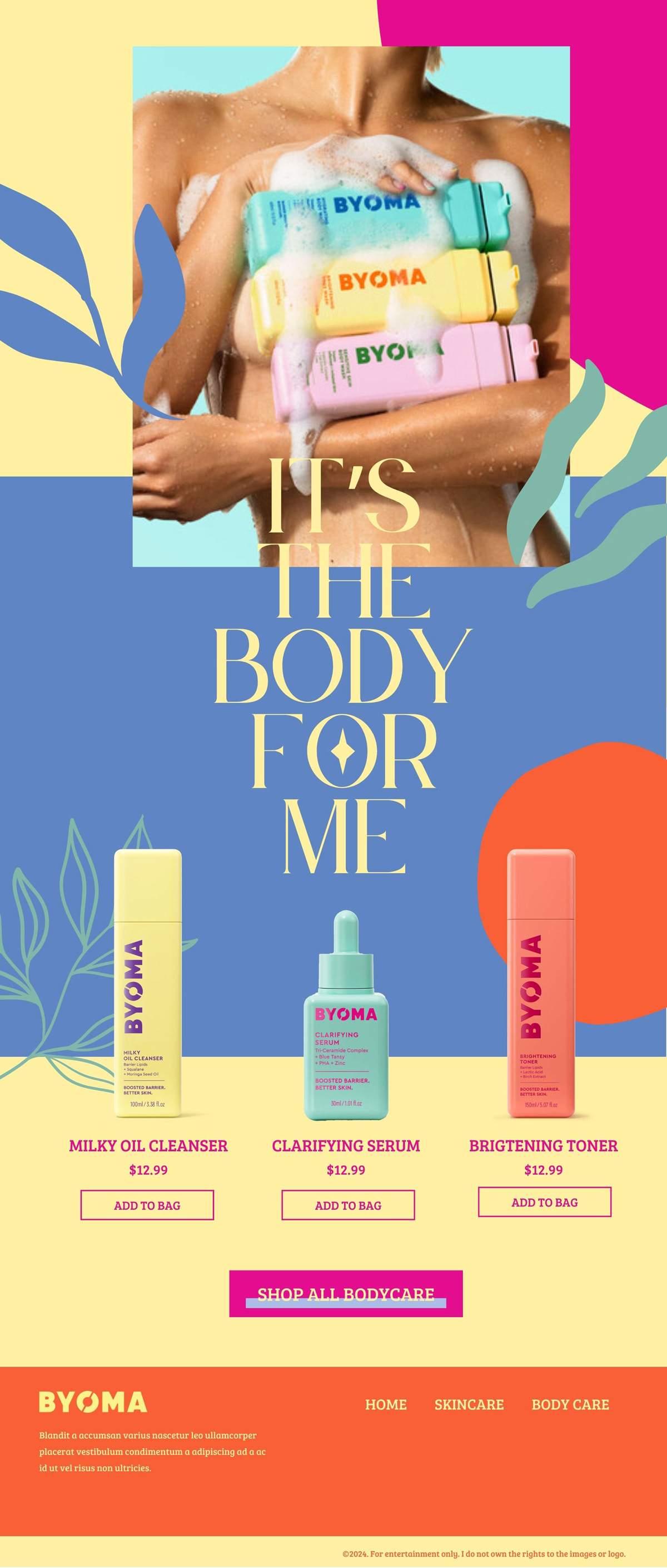
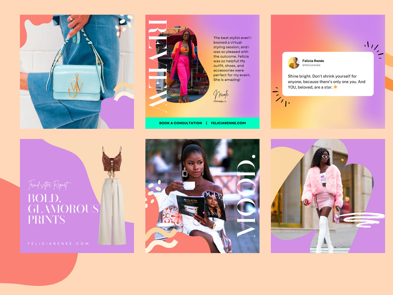
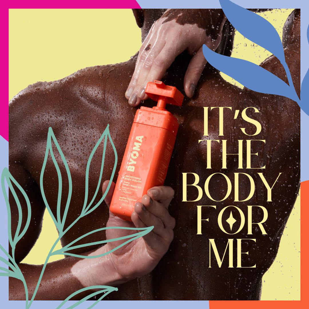
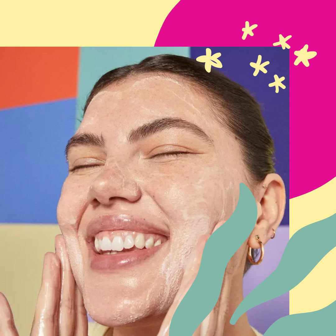
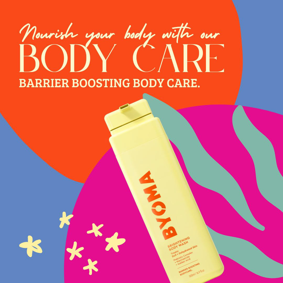
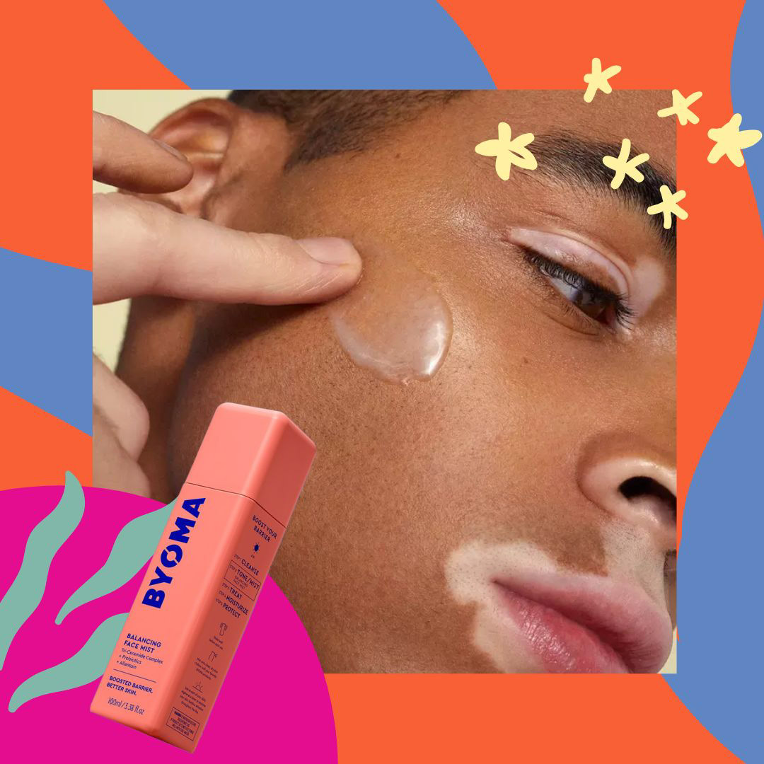
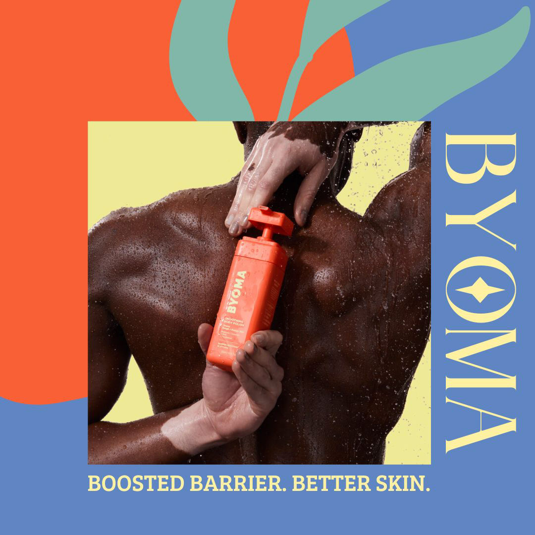
Social Media Graphics
A collection of social media graphics I created based on the look and feel of the updated landing page design, which creates a cohesive experience for their customers.
⬇️