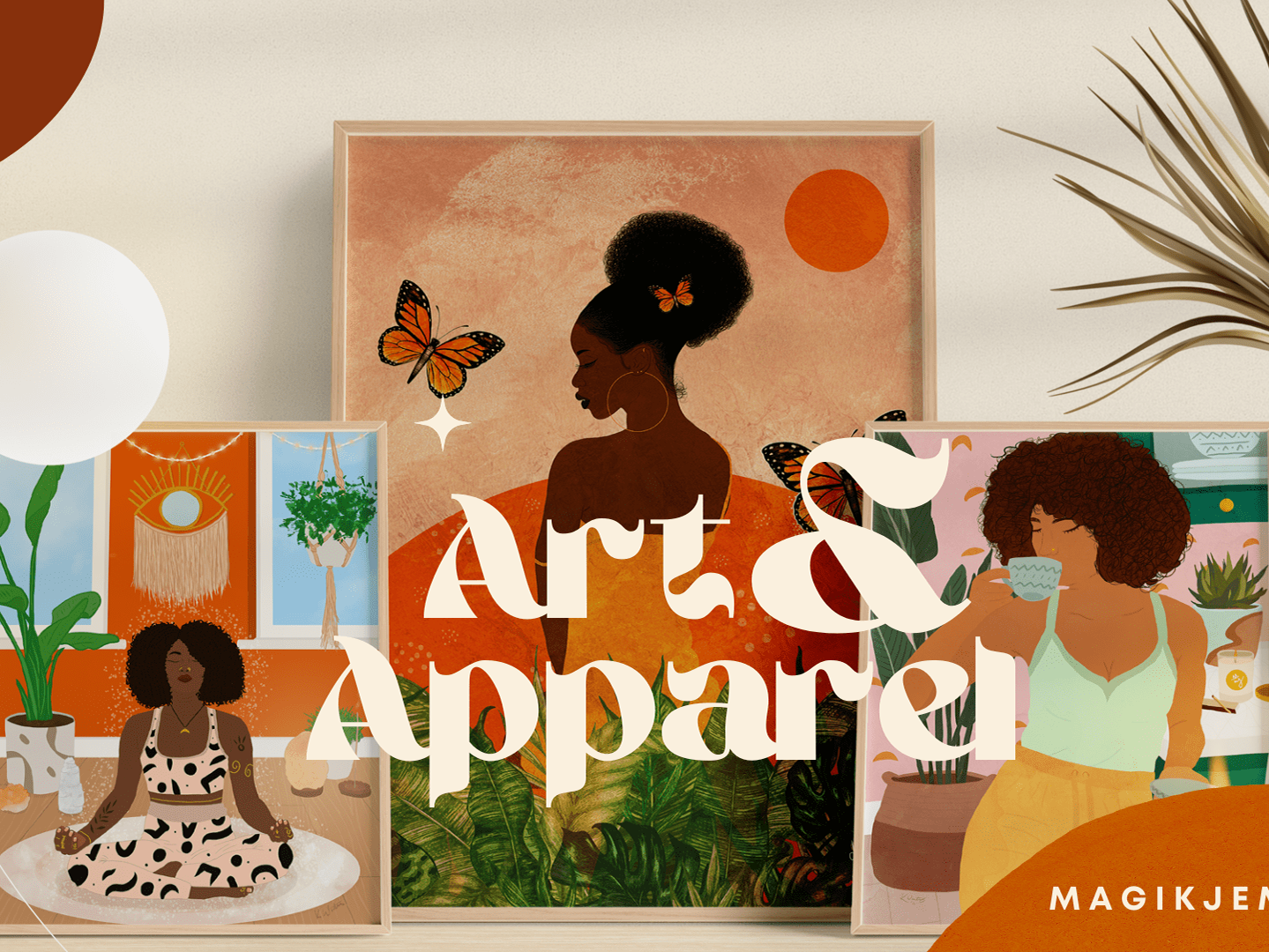
Graphics for the 2026 CarefreeBlackGirl Tour
Disciplines: Event Flyers, Templates, Illustration
Role: Designer, Art Director, Illustrator
CarefreeBlackGirl, LLC is a lifestyle brand that has created spaces for Black women and femmes for 10 years. The CFBG Cookout is their annual touring festival that brings people together by celebrating art, community, sisterhood, fashion, and wellness. The primary themes of The Cookout experience include empowering entrepreneurs, building community, and amplifying culture.
This design project encompasses the following design materials to help promote their 10th Anniversary 2026 Cookout Tour:
• Main tour flyer
• Tour flyers for each city (12 stops)
• Ambassador template
• Vendor template
• Artist template
• Artist collage
• 10th Anniversary T-Shirt Design
For this project, the Client wanted “illustrations, bright colors, and welcoming graphics.”
⬇️
Creating the Overall Concept
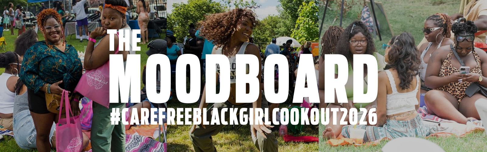
Based on my initial research and the client call, here are some of my initial design notes that highlight the themes and design direction I explored.
Diversity: Create illustrations featuring diverse Carefree Black Girls
Good vibes: Cookout meets creative festival; Smiling, dancing, community; Overall vibe inspired by music festivals and family cookouts
Groups: Some people dancing, some people sitting, some people standing in groups, but all very communal, vendor tents
Fun & Lively: Colorful and vibrant graphics
Personal connection: Pull inspiration from summertime Chi (my hometown) and how good it feels
Inspo song: “Feels like Summer” by Donald Glover
The Design Concept
Since it's CarefreeBlackGirl’s 10th anniversary, my mission was to create a design system that reflected the established foundations of what they’ve built over the years by focusing on 4 primary themes.
💃🏾🛍️ Activities
Showcasing activities for everyone (shopping, chilling, dancing, music).
🎨👧🏾 Illustrations
Gives a nod to the simple, carefree times of childhood.
👩🏽👩🏿 Togetherness
Highlighting sisterhood and community.
🤳🏾📸 "A time was had"
Making and sharing memories.
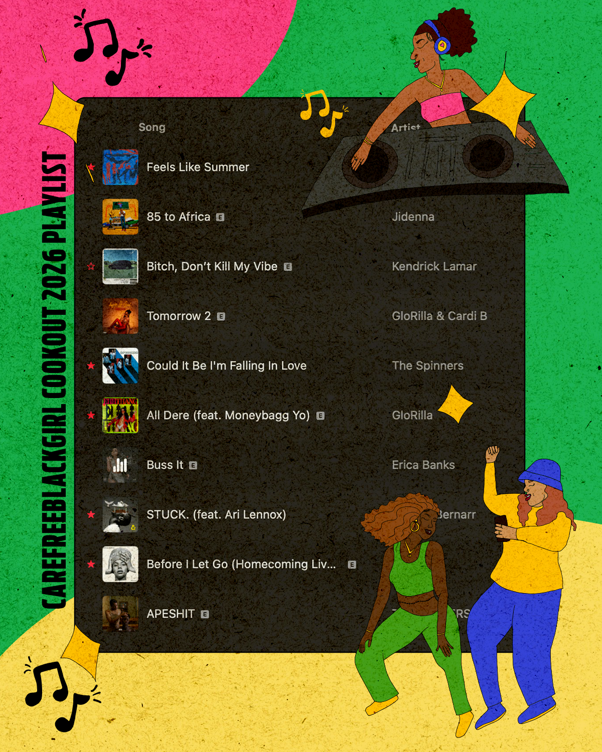
Curating a Design Playlist
Music is one of my primary sources of inspiration.
When I’m working on a project, I will typically either choose one song to play on repeat or I will create a playlist to listen to while I’m coming up with concepts and creating the designs. Over the course of the project, that playlist expands to encompass the whole vibe. Since this project spans over the course of a year, having a designated playlist to listen to really helps me keep the design vibe and aesthetic consistent.
Can you see how my playlist inspired the vibe of the design?
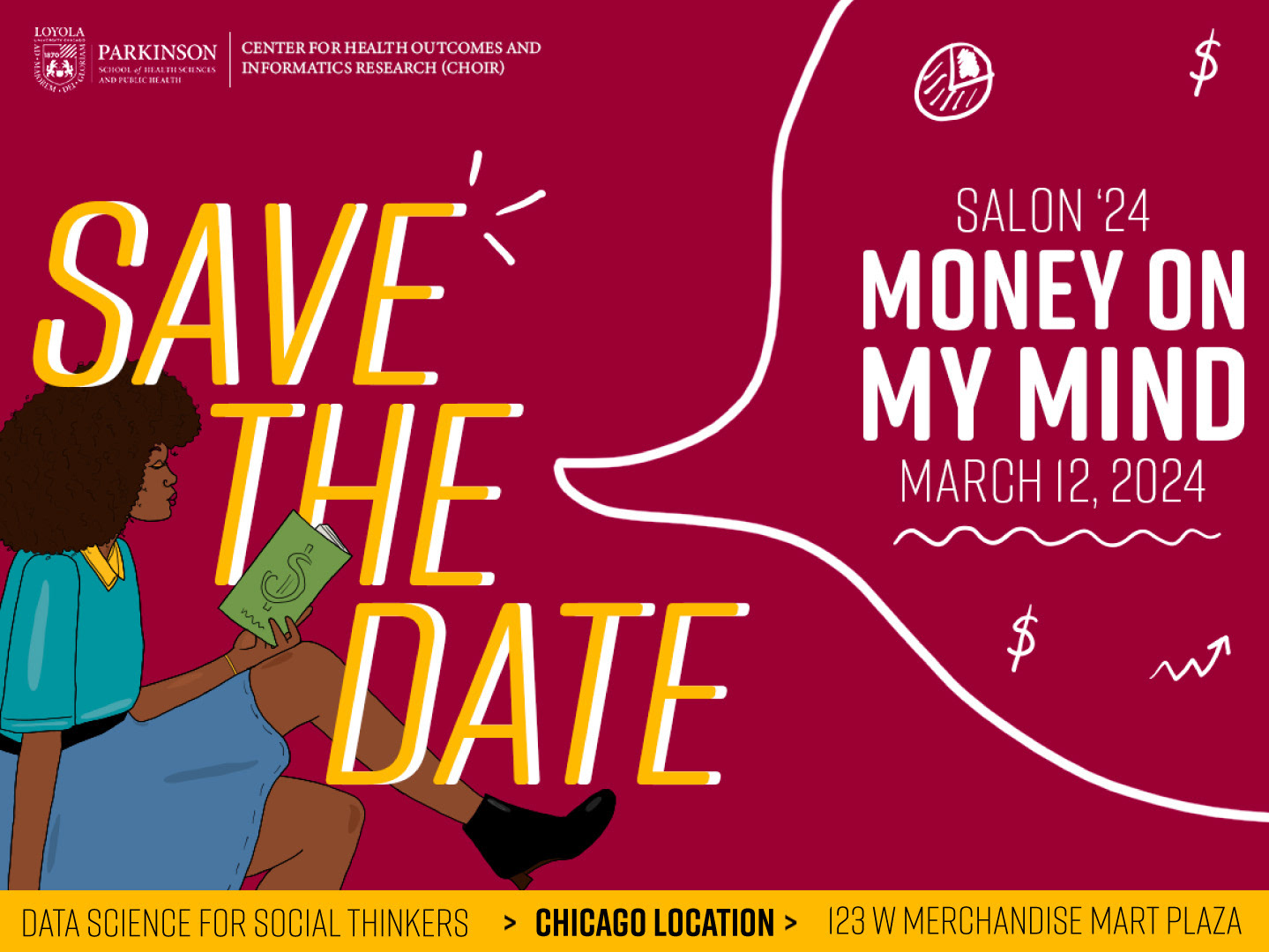
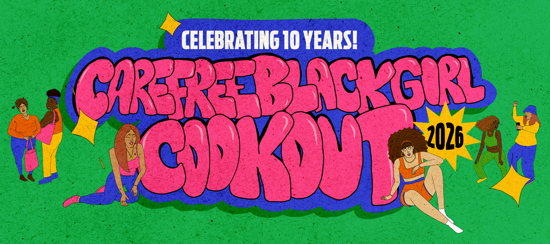
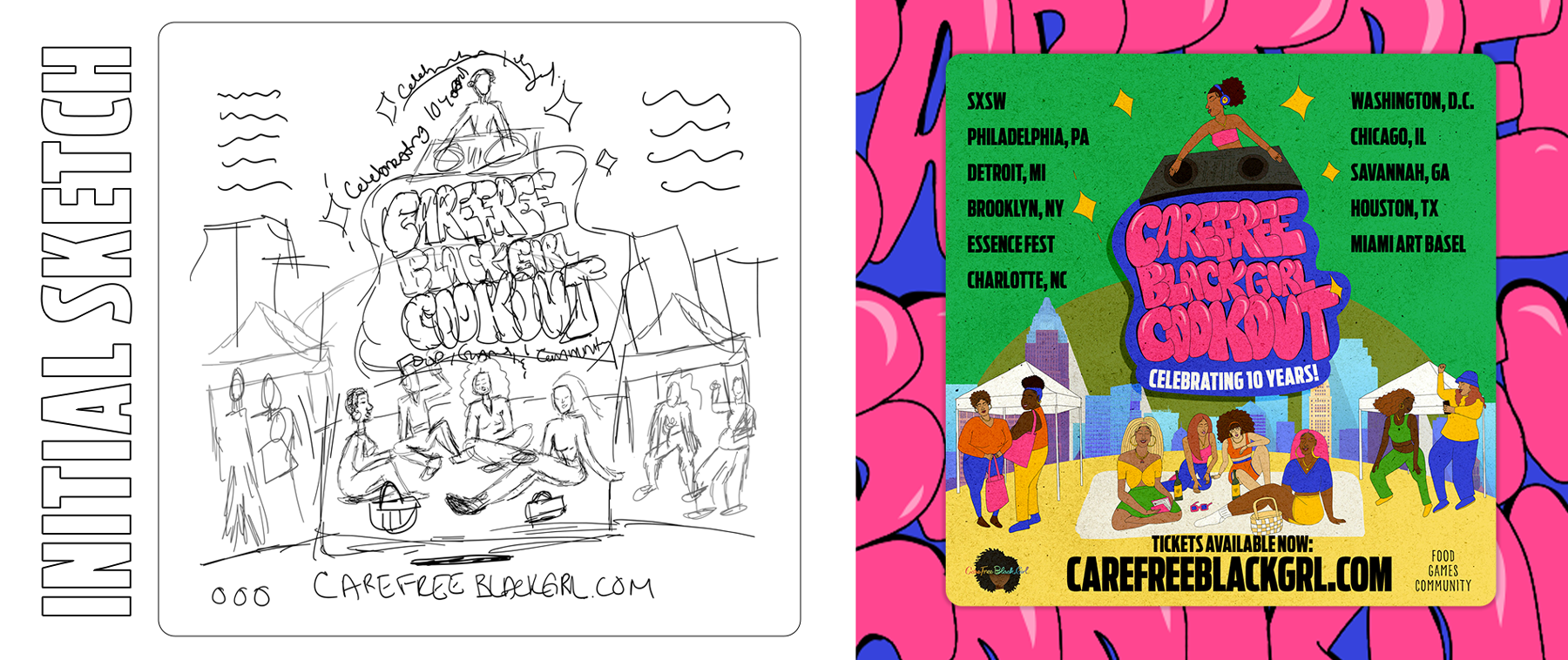
Main Tour Flyer Concept:
Sketch vs Graphic
Sketch vs Graphic
Graphic Templates
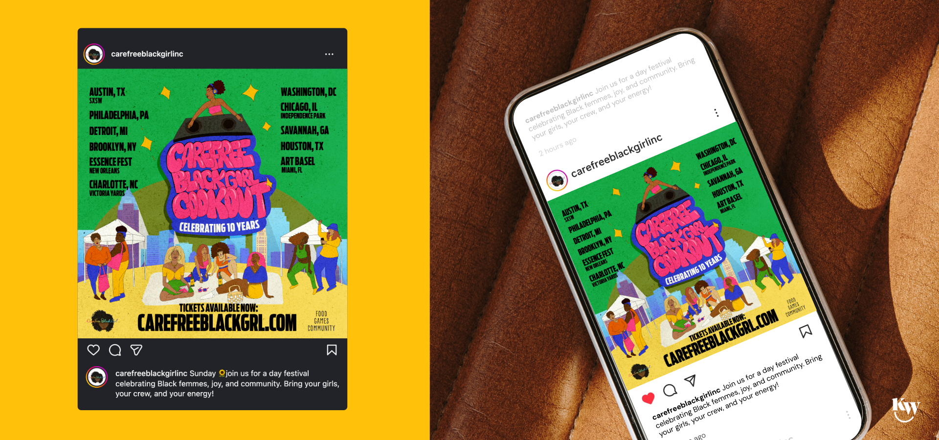
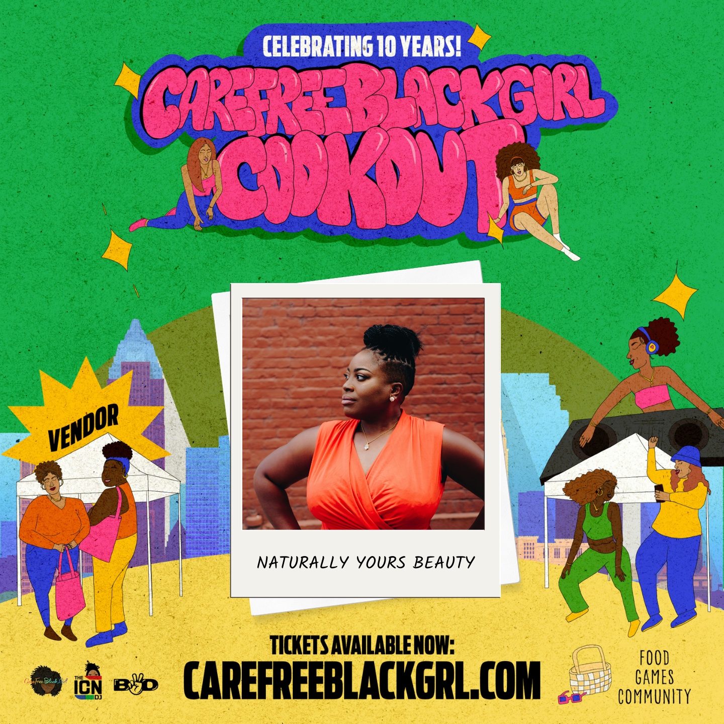
In addition to the tour graphics, I created templates for Ambassadors, Vendors, and Artists (for each city) to promote The Cookout events and themselves, leading up to the event date. For the Ambassador template design, I went with a "Star" focal point. For the vendor and artist template designs, I used a Polaroid photo-inspired graphic to tie into the theme of “making memories”.
Instead of having to create their own graphics to post on social media, these graphic templates are a great way for people to easily let their followers know they will be in attendance.
I created these graphic templates in Canva for easy updating and included a PDF document with instructions on how to update their image and name. The goal was to make the experience seamless because the easier it is to update the template, the more likely people are to use the graphics.
This leads to more people promoting the event, thus increasing reach.
Unique Elements
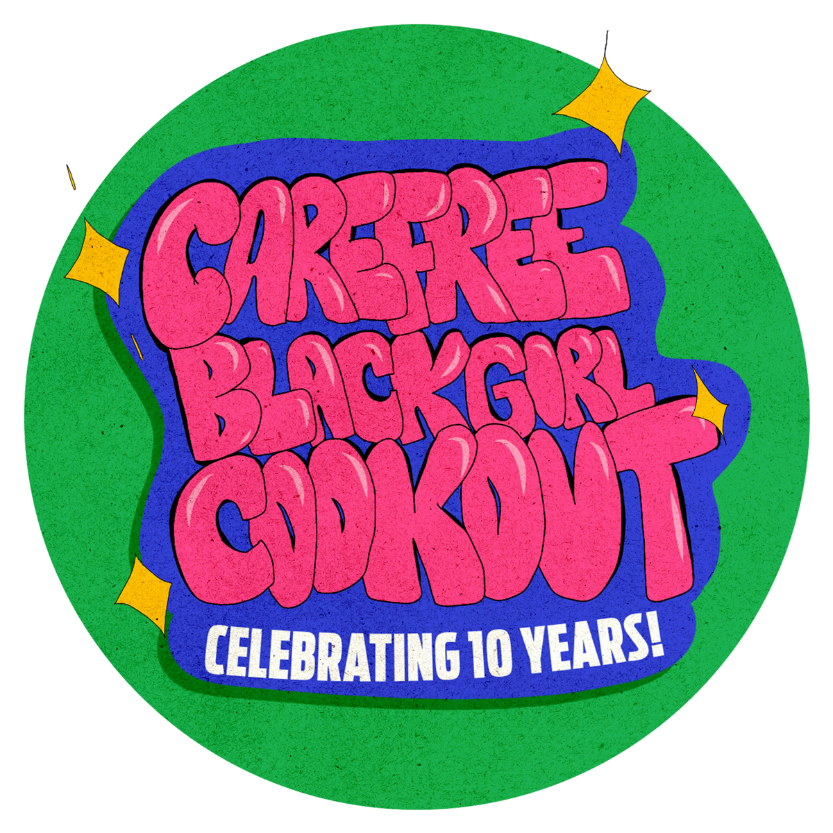
Custom Typography
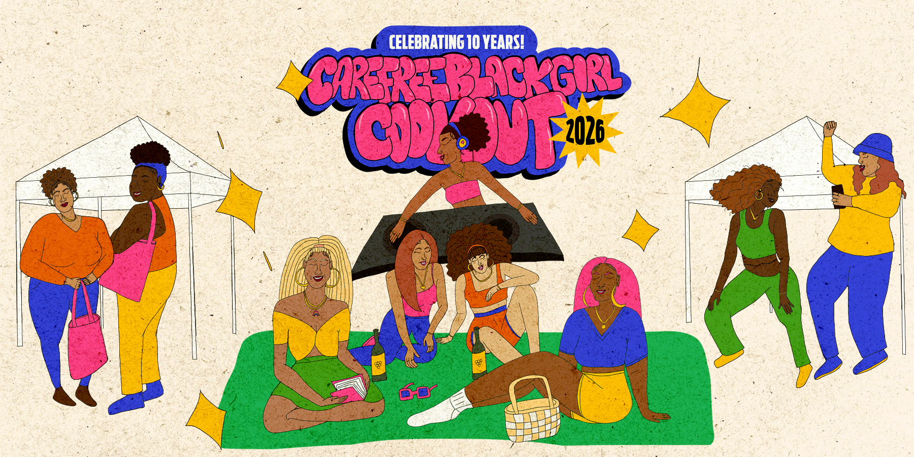
For this project, I designed a custom bubble font. I wanted the event name to really stand out and capture attention, so I hand-drew a custom bubble font that is reminiscent of colorful and playful graffiti art.
Textured Look & Feel
I wanted the design to feel dynamic and stand out, not fall flat, so I used texture to give it a nostalgic, childlike feel. With the texture, the flyers almost seem like paper and are reminiscent of the colorful construction paper from the carefree days of childhood.
Custom Illustrations
Hand-drawn characters with playful, childlike energy.
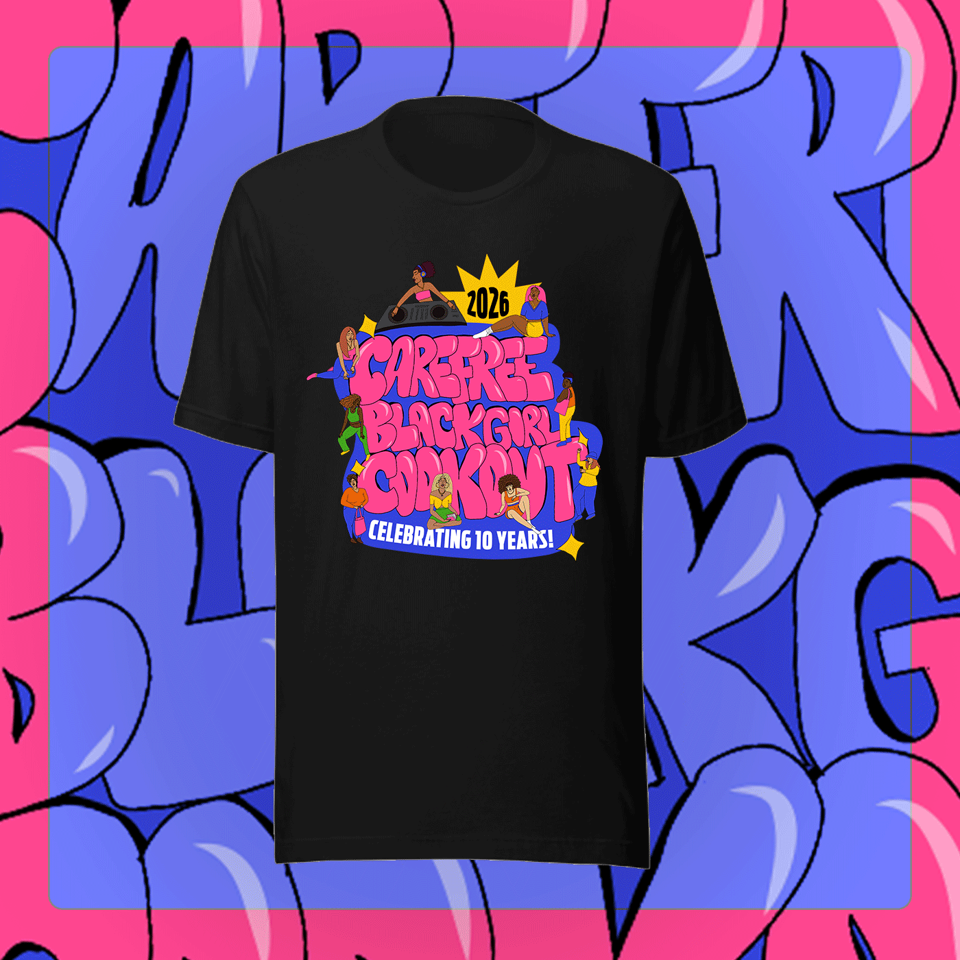
10th Anniversary Tour Shirt
The t-shirt design is based on the tour flyer. I made the event name the primary focus, while incorporating the character illustrations to highlight and further reinforce “community” and “culture.”
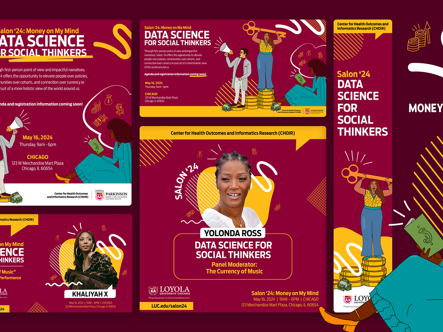
Tour Graphics (ongoing)
Flyers and templates for the main tour graphic, SXSW, Detroit, Brooklyn, Philly, Charlotte, Washington DC, and Chicago.
More images will be added as the tour graphics go live.
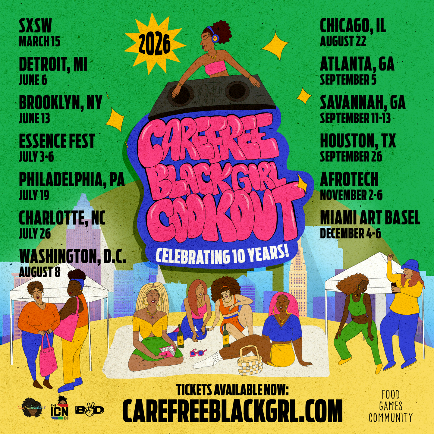
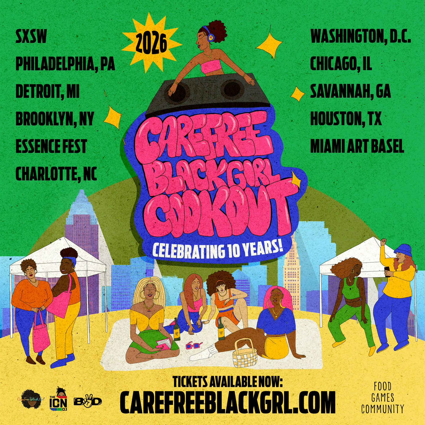
Main Tour Flyer Dates

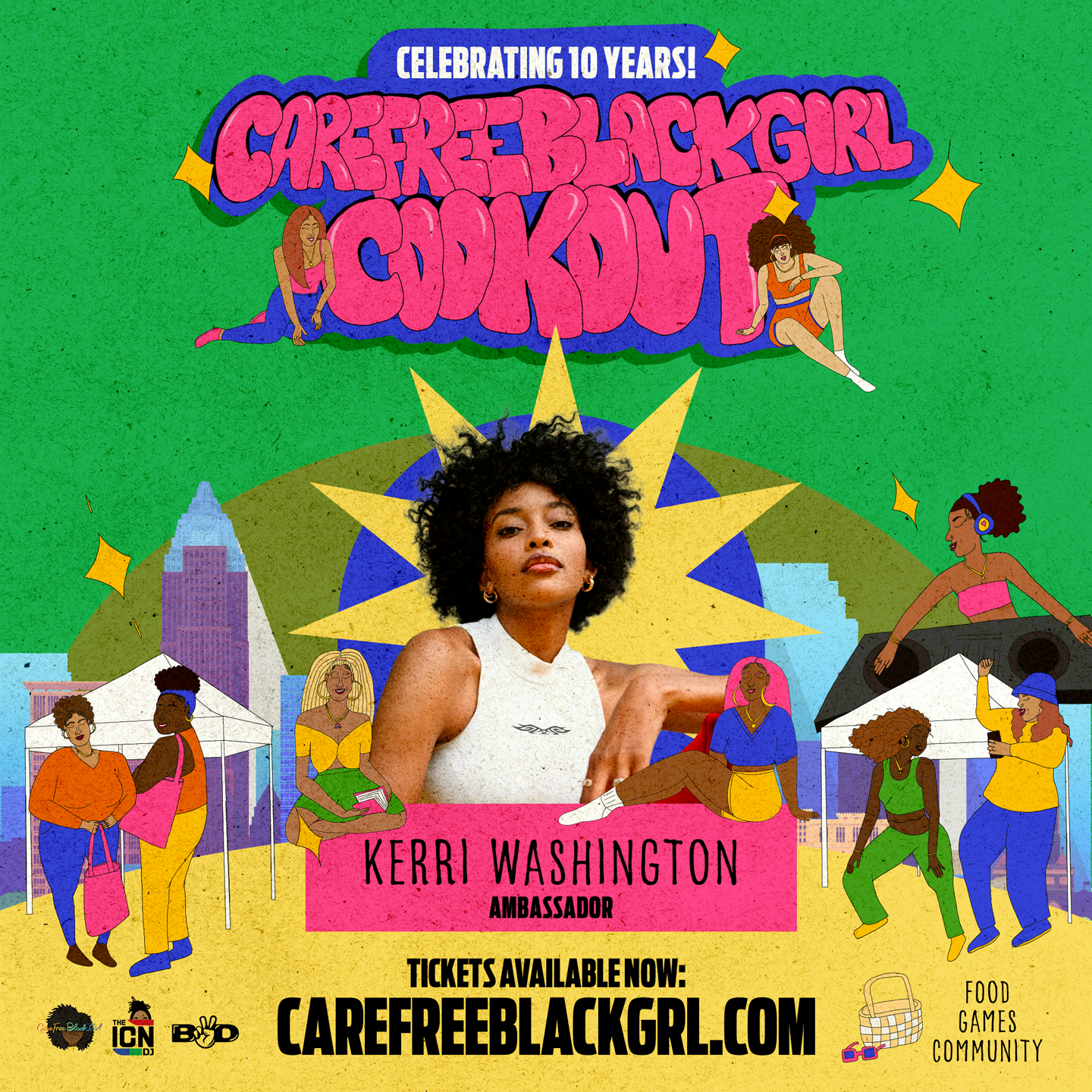
Ambassador Template Graphic
Main Tour Flyer
Early Vendor Graphic
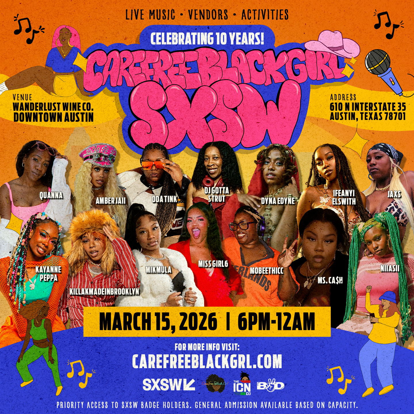
SXSW Event Flyer
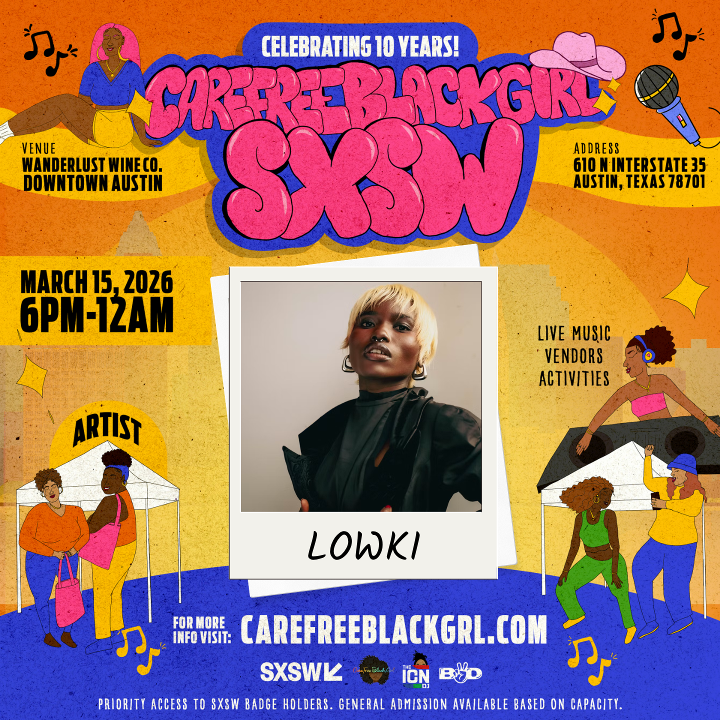
SXSW Artist Template
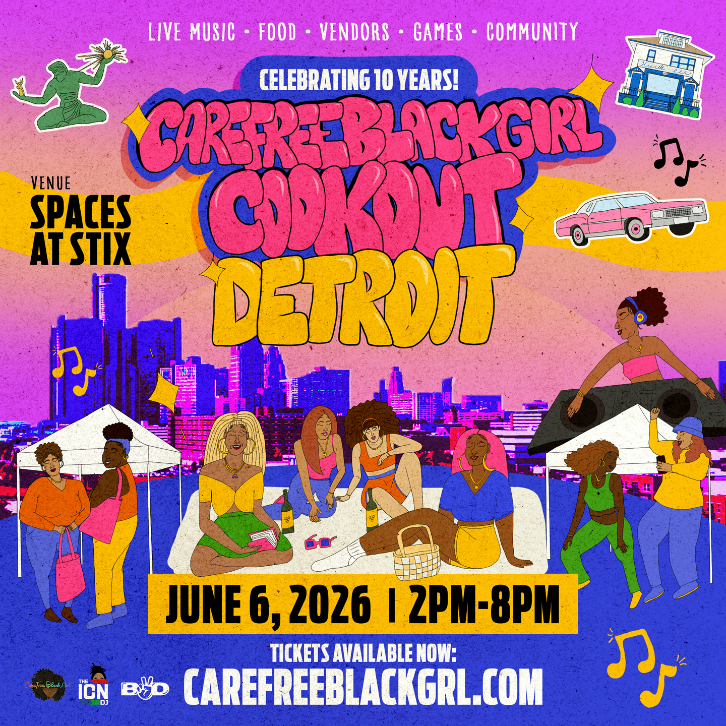
Detroit Cookout Flyer
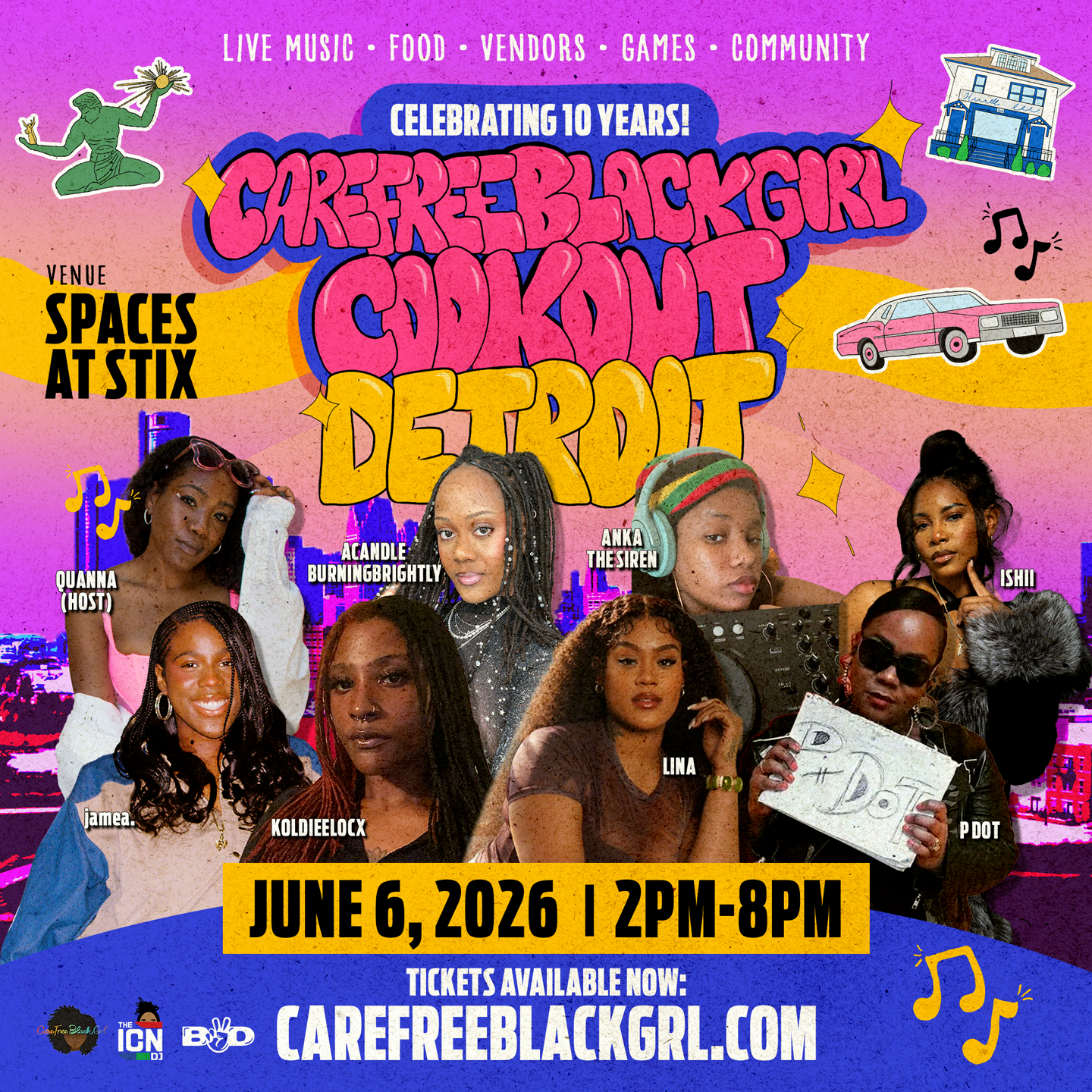
Detroit Artist Collage
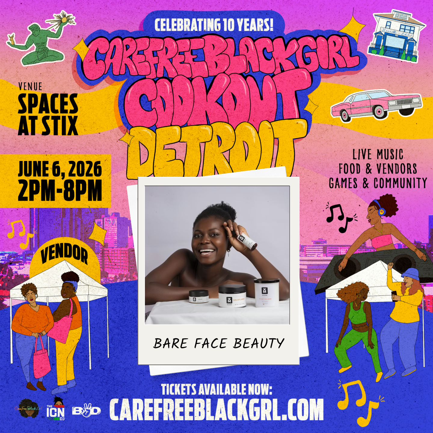
Detroit Vendor Template
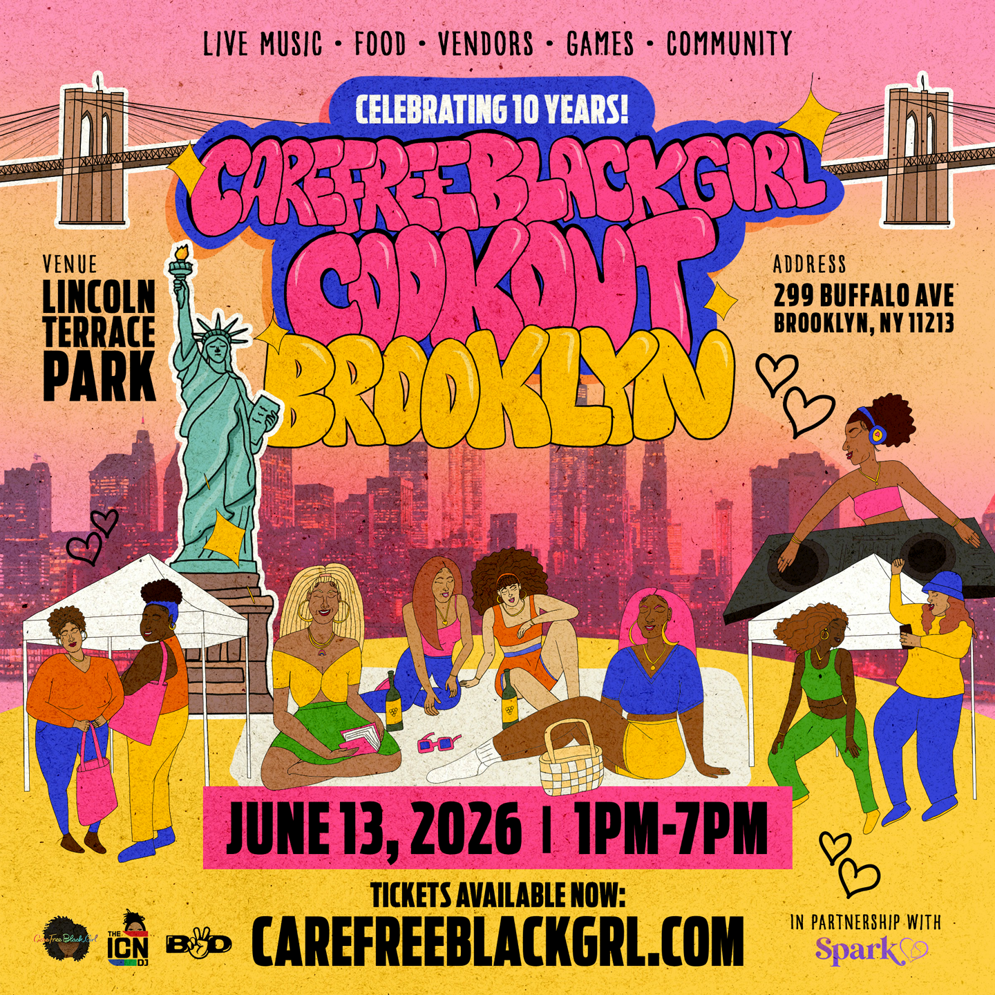
Brooklyn Cookout Flyer
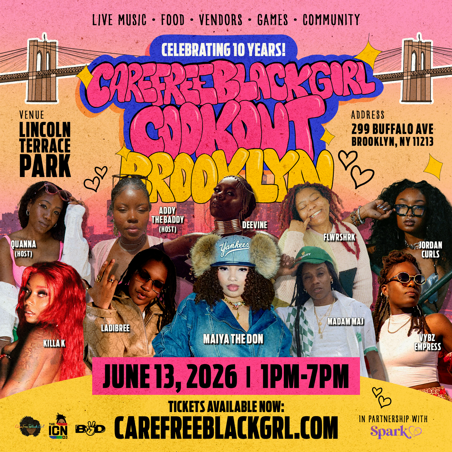
Brooklyn Artist Collage
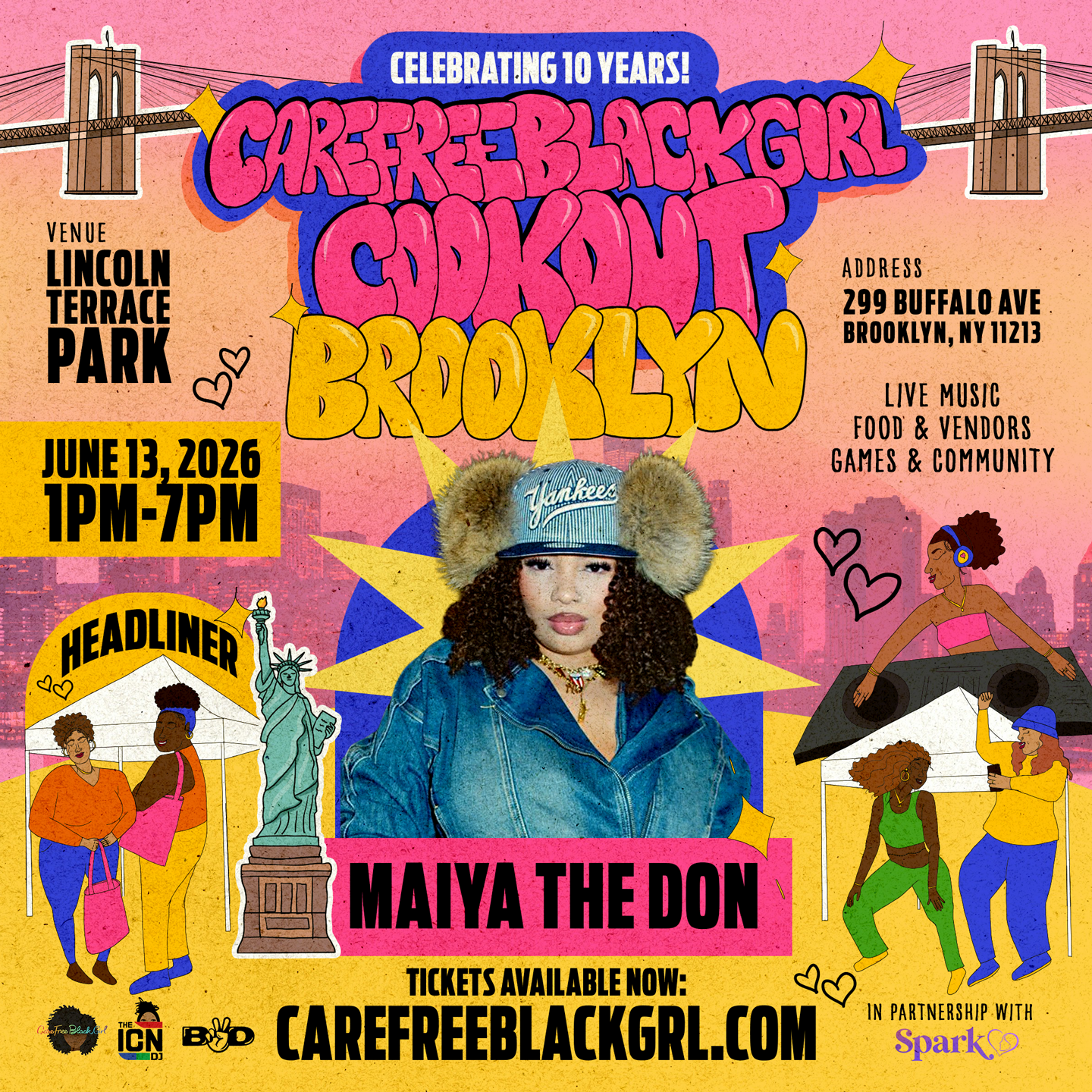
Brooklyn Headliner Flyer
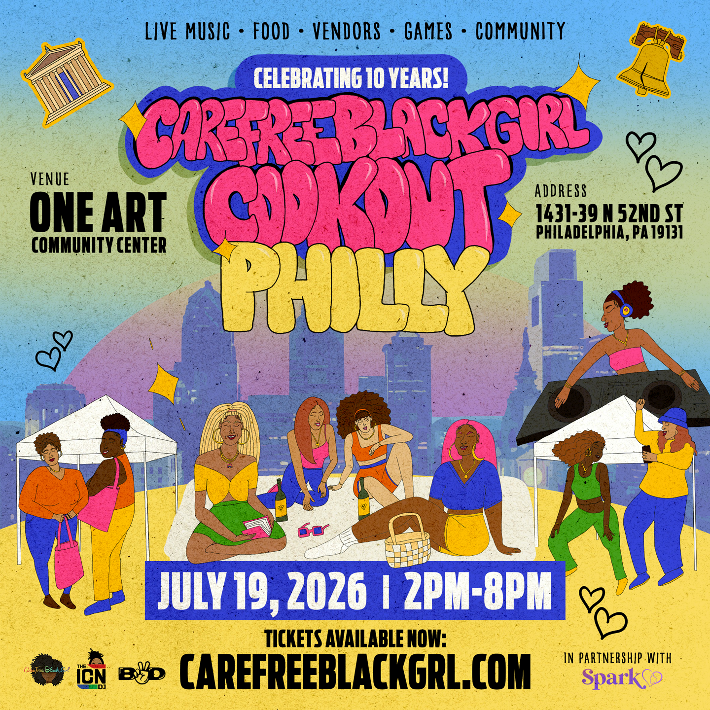
Philly Event Flyer
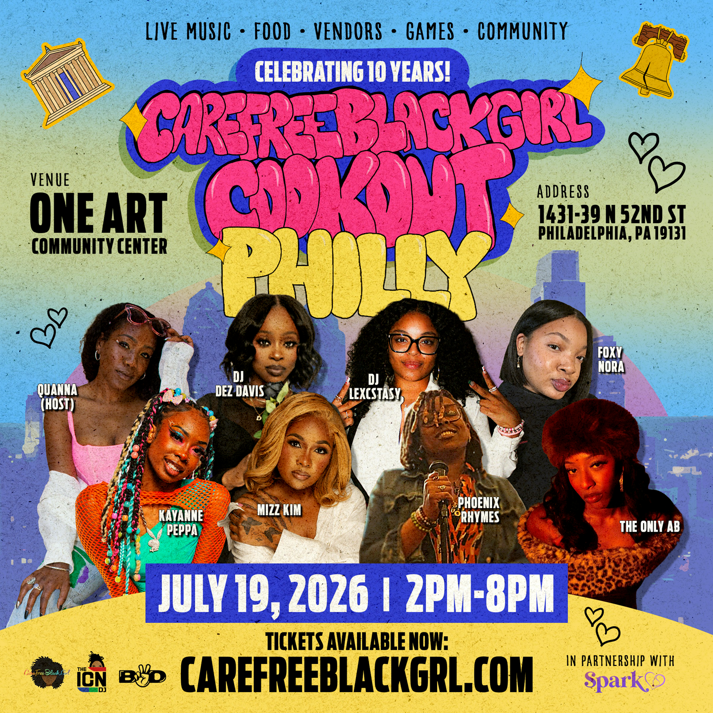
Philly Artist Collage
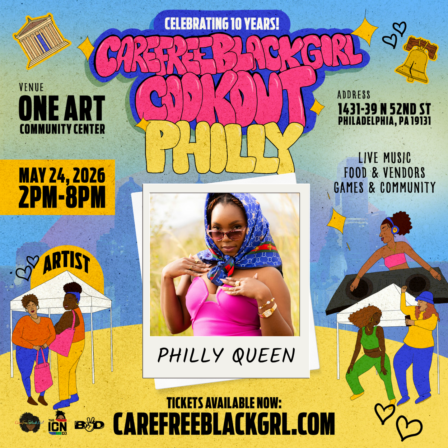
Philly Artist Template
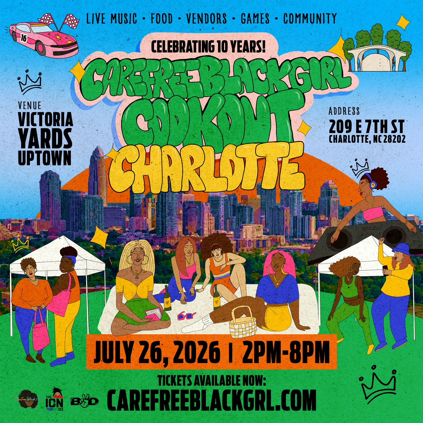
Charlotte Event Flyer
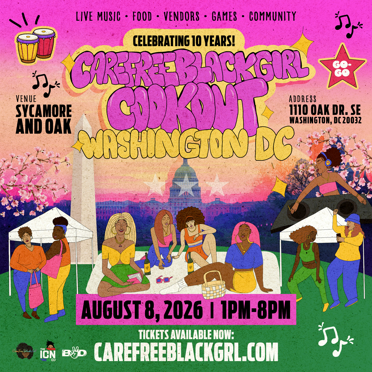
Washington DC Event Flyer
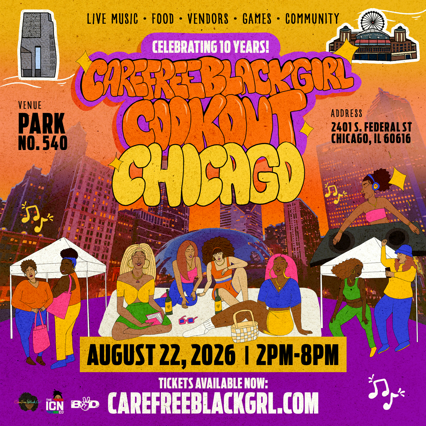
Chicago Event Flyer
⬇️